EDITOR’S NOTE: This essay is reprinted here with the gracious permission of City Journal, who first published it in the Autumn 2000 issue of their magazine.
It’s time to start thinking hard about tearing down Lincoln Center and building up a new, much better one – an architectural masterpiece that will signal New York City’s miraculous recovery over the last decade and its renewed confidence that it will be the capital of the twenty-first century as it has been of the twentieth. To start that rethinking, this issue of City Journal offers plans by leading architects of what a new Lincoln Center could look like. The dramatic differences among the schemes, all of which are classical but each of which envisions the arts complex in a new and original light, suggest what a range of possibilities for improvement exists. Any one of the three would be splendid, a major enhancement to the city in many ways.
A pipe dream, you say? Consider this: Lincoln Center is in terrible physical condition, requiring, according to its management, $1.5 billion – yes, billion – to repair it. Its travertine marble facing is melting away like sugar in Gotham’s polluted air; its flimsy modernist architectural construction needs major restoration, in a hurry. That $1.5 billion would go very far toward paying for a completely new complex of buildings. And were it spent to restore the current complex to its original condition, the same underlying structural problems would almost certainly require another gargantuanly expensive restoration only three or four decades in the future. So every future generation will have to pay for Lincoln Center all over again.
If Lincoln Center were an architectural treasure – even if it were only acoustically and technically a superb machine for presenting the performing arts – the huge cost would make sense. But tearing it down is no desecration. From the time the building first went up, architectural critics have dismissed it as mediocre, and music critics have rated its sound as nothing special, even after Avery Fisher Hall’s endless and expensive acoustical remodelings and the New York State Theater’s current, desperate experiment with electronic amplification, to the derision of opera lovers.
In fairness, Lincoln Center is a triumph of city planning, its symmetrical layout and formal, fountain-adorned plaza an embodiment of the City Beautiful urban vision advocated by such turn-of-the-last-century architects as McKim, Mead, and White and Richard Morris Hunt and realized most fully in the 1892 World’s Columbian Exposition in Chicago. New Yorkers like the plaza; even if they deprecate the individual buildings, they take pleasure in the formal, ceremonious, celebratory public space the ensemble forms.
It’s a city-planning success in a more down-to-earth way, as well. Parks Commissioner and Gotham planning czar Robert Moses first envisioned the Center in the mid-1950s as a lever to uplift the entire Upper West Side of Manhattan, then in deep decline. New York had first permitted single-room-occupancy residences in 1939; 15 years later, an influx of the poor living in such SROs and in rent-controlled apartments, including thousands of new immigrants from Puerto Rico, made observers fear that the Upper West Side was fast decaying into a permanent slum, dirty, crime-ridden, and fear-inspiring. Time has proven Moses right: the building of Lincoln Center, creating a real sense of place with its graciously proportioned outdoor room, was the first in a series of events that led to an emphatically revivified section of the city, with businesses flourishing and property values skyrocketing in a wide swath around the complex and stretching many blocks to its north. As then-Center president John D. Rockefeller III put it, the complex was intended as “a new kind of city therapy.”
But as architecture, oh dear. The Center was deplorable, as critics recognized from the start. Despite the mountain of money lavished on it, despite the vast expanses of travertine, despite its almost endearing anxiety to look monumental, it looked cheap and cheesy. Philip Johnson’s New York State Theater presented to Columbus Avenue – the ceremonial front of Lincoln Center – a blank wall, as if, having run out of ideas after he’d finished with the front, he had tacked up travertine like sheetrock around the rest of the building. Inside, while tiers of galleries rising above the atrium lobby turned the audience itself into a festive spectacle during intermission, critics complained from the start that the galleries looked like a maximum-security prison in their metallic angularity, especially since the whole soaring space culminated in an unadorned ceiling that again seemed testimony to architect Johnson’s mental exhaustion.
Max Abramovitz’s Philharmonic Hall, renamed Avery Fisher Hall after the hi-fi magnate gave $10 million toward the gutting of the acoustically challenged structure and reconfiguring it so that it sounded adequate and the musicians could hear one another, [and subsequently renamed again after David Geffen gave even more towards redeeming the hall] gives the concertgoer the sensation of being in an extremely upscale shopping mall, all its adornments failing to disguise the plain concrete box it really is. Its low-ceilinged lobby and workaday escalators create a sense of placelessness that makes you wonder as you ascend if you will emerge into a food court dominated by Wendy’s and Domino’s Pizza. But no: instead you emerge into a space dominated by Richard Lippold’s appalling “sculpture,” composed of giant copper and zinc alloy blades suspended from wires like the sword of Damocles and looking like a tort suit waiting to happen.
As for Wallace Harrison’s Metropolitan Opera House, architecture critics couldn’t resist the comparison with Miami Beach hotels, and they observed that two giant blank walls almost right up against the glass facade necessitated the huge Chagall murals to cover them, like colossal “Hallmark Chanukah cards,” as Lincoln Kirstein dismissed them with Olympian asperity. At least the design as built was better than an earlier version, in which the five great arches on the facade resembled the toes of a giant foot.
Most critics, as the individual buildings opened between 1962 and 1969, charged that they failed because they weren’t modernist enough. In fact, the reverse was the case: they were insufficiently traditional. As it was, the architects of the three principal buildings fell between two stools. As they attempted to cling to their modernist principles while at the same time making a nod toward the tradition of classical architecture, they created a kind of proto-postmodernism: modernist buildings with some traditionalist doodads tacked on. Lacking postmodernism’s smart-aleck “irony,” though, these buildings really are nothing but kitsch – sentimental and insincere evocations of something meaningful, without any understanding of, or passion for, the underlying ideal. So perhaps the best critic of the complex was Lyndon Johnson’s wife, Lady Bird, who at the Opera House’s opening gushed: “Ah have an impression of red; Ah have an impression of gold; Ah have an impression of chandeliers.” Crude impressions of bygone elegance, shreds and patches of tradition, is what Lincoln Center’s architecture is all about.
The instinct of these architects to make at least a gesture toward classicism was understandable. As the managers of the Metropolitan Opera correctly perceived, classical architecture was the appropriate style for the entire complex – real classical, not stagey pastiche. Lincoln Center was to be an acropolis for New York; in a secular city, it was to be a shrine for the arts, a testament to man’s capacity to imagine and represent an ideal world of beauty and harmony, of self-discipline in the service of an ideal, of the communal celebration of man’s spiritual nature and noblest aspirations. To use for this purpose the architecture that the Greeks invented to build temples makes perfect sense. Lincoln Center, moreover, was to be a living museum of our cultural and artistic inheritance, where we prove every day that the masterworks of our ancestors – of Handel and Mozart, Verdi and Wagner – speak to us just as movingly and meaningfully as to their contemporaries of the human spirit, its yearnings and ideals. Why not, then, clothe it in the architecture we inherit from Palladio and Michelangelo, from Inigo Jones and Christopher Wren – another living tradition? Finally, what could be more suitable than the architecture of democratic Greece and republican Rome for a project that, like such great New York public spaces as Central Park and Grand Central Station, was to be a gathering place for all New Yorkers?
Understandably, the men of the late fifties and early sixties would have found it hard to take this course. Modernism wasn’t just architecture’s prevailing orthodoxy but indeed its sole dogma. Established architects of the era spoke with reverential familiarity of “Corbu” and affected his little round glasses. They believed that modernism was the only possible style that spoke to the present and the future. To us, half a century later, modernism is beginning to look tired and dated. The boring grid-wrapped boxes that fill our cities are so alike and uninspired – just look at the New York Times’s recently published photos of proposals for its new office building – that it’s hard for us to understand why modernism’s champions defended this style as original. Today, too, as the hierarchical corporations that built their headquarters in this style have flattened and decentralized their management structures, the modernist grid that expressed that structure looks as dated as Charles Bluhdorn’s Gulf and Western or Hal Geneen’s ITT. To us today, the modernist grid speaks not only of soul-deadening, anti-individualist technocratic bureaucracy but of something much more sinister – of the totalitarianism of the central planner, who sees the Big Picture into which the mass of mere individuals must fit for their own good, whether they like it or not.
Today we are quite unembarrassed about finding the Beaux Arts skyscrapers of lower Manhattan inspirational, with their wealth of classical details and sophisticated traditional vocabulary – infinitely preferable to the dull mechanical boxes that the last 50 years have crowded into the city. If given the choice, most of us would prefer the classical limestone buildings that lined Park Avenue in midtown at mid-century to the glass and steel structures that replaced them, and we’d take the Flatiron Building, with all its lively humanity, over even the best of the modernist creations, Mies van der Rohe’s chilly Seagram Building, with its doctrinaire uniformity of light fixtures and window blinds. Today’s New Yorkers love the restored Grand Central Station and Public Library reading room and the grand new Greek galleries in the even grander Metropolitan Museum. This classicism is the architecture of Gotham at its pinnacle of twentieth-century greatness; it is the fitting style for New York’s moment of twenty-first-century greatness, as well.
This is an extraordinary epoch in the city’s history. A degree of public order and civility and safety reigns that longtime New Yorkers thought we’d never see again. Businesses both small and large are flourishing. New Yorkers have created vast amounts of wealth by financing the corporate restructuring that has retained American industrial supremacy and by establishing Internet businesses that hold out the promise of future prosperity. A restored and reclaimed Bryant Park and Central Park are indices of the city’s recovery, both civic and economic. And so great is the turnaround that our own turn-of-the-millennium tycoons are moving back into the mansions that the Gilded-Age magnates built but that only institutions have been able to use for most of a century.
Even so, New Yorkers have the sense that we can never really equal the extraordinary inheritance we have received from our Gilded-Age forebears. As we glide up the Metropolitan Museum’s grand staircase, we can’t help thinking that we could never again build something as magnificent. We could never replace Penn Station, which our own era barbarously destroyed, along with the many other ingenious lovely things that are gone.
But why not? We have the wealth. The grand classical style belongs to us and is our city’s defining idiom. We have shown, in Kevin Roche’s excellent but little-heralded 1993 addition to the Jewish Museum, that we have the technical skill to build as beautifully in stone as our ancestors built. So why not build a monument like those sketched out in the plans that follow, financed by our modern Medicis? Why not build a Lincoln Center that will last for centuries and testify that we knew how to conceive a city and build it as splendidly as any great urban civilization did?
To build this way is not an exercise in Disneyland nostalgia, as the champions of modernism and postmodernism would charge. One of the astonishing qualities of the classical idiom is how it lends itself to continual renewal and reinvention. No one could say that Stanford White or Charles Follen McKim or Edwin Lutyens were not both of their time and original, even while they took their places in the great tradition that Vitruvius first codified in Roman times. Who would mistake the Century Club or the buildings of Columbia University as belonging to any other era than around the turn of the twentieth century, for all their correct and utterly confident classicism?
So too with the plans that follow. Each one interprets classicism in its own twenty-first-century way. Each conceives of the urban space in a different way, with Quinlan Terry hinging the Center organically to the grid of the city by means of a triumphal arch and a tempietto, and Robert Adam similarly enlarging the Center’s space by creating a Lincoln Square where none now exists and, in the process, making some sense out of the confusion of the crossing of Columbus Avenue and Broadway. Each one of these schemes is designed to last; each one declares that New York confidently takes its unique and original place in the great procession of Western civilization.
To suggest such a course is naturally to invite others to come forth with their ideas, too. Such a vision of possibility is bound to fire many fertile imaginations. Some will come to the defense of the existing complex: it’s hard not to feel affection for a place where we’ve all spent so many happy and uplifting hours over more than three decades. Almost certainly, the New York Times’s Herbert Muschamp will come forward to suggest a postmodernist scheme: one of Frank Gehry’s giant titanium coprolites, say, or some slick pastiche by Christian de Portzamparc, whose one or two classical details – stage-set simulacra, really – always make you wonder why the property owner couldn’t afford the real thing. These will look dated as soon as built, however.
Why not build instead something that real New Yorkers, not just the elites, will love, and that will show our posterity – and us, too – that we can build for the ages?
Quinlan Terry
The proposal for the redevelopment of New York’s Lincoln Center is for a group of new buildings in the great American Renaissance classical tradition. The buildings would be in Indiana limestone in load-bearing masonry and therefore built to last for many generations. This is in contrast to the buildings currently occupying the site, which are already suffering from the familiar problems associated with frame construction.
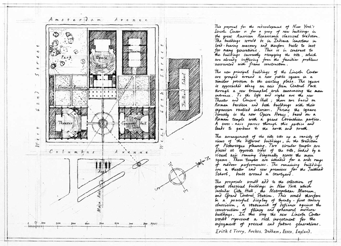
The new principal buildings of Lincoln Center are grouped around a new public square in a similar position to the existing plaza. The square is approached along an axis from Central Park through a new triumphal arch announcing the main entrance. To the left and right are the new Theater and Concert Hall; these are based on Roman basilica and bath buildings with their expansive vaulted interiors. Facing the square directly is the new Opera House, based on a Roman temple with a giant Corinthian portico. A cross-axis passes through this portico and leads to gardens to the north and south.
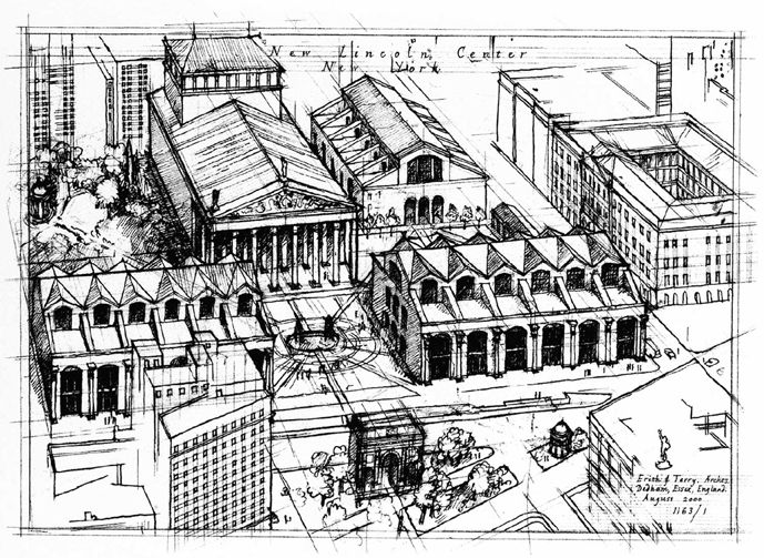
The arrangement of the site sets up a variety of views of different buildings, in the tradition of Picturesque planning. Two circular temples are placed at opposite sides of the site, linked by a visual axis running diagonally across the main square. These temples are intended for a wide range of outdoor performances. The remaining buildings are a theater and new premises for the Juilliard School, built around a courtyard.
The proposals would add to the collection of great classical buildings in New York, which includes City Hall, the Metropolitan Museum, and Grand Central Station. This would therefore be a powerful display of twenty-first century classicism, a statement of defiance against the construction of flimsy and ephemeral modern buildings. In this way, the new Lincoln Center would represent a rich investment for the enjoyment of present and future generations.
Robert Adam
Lincoln Center is a curiosity. It is as if modernism lost its nerve and, bankrupt of any vocabulary for civic building, turned to crude classical planning and the distorted vestiges of columnar arcades. Now, even its concrete structure has let it down. There is no credibility left. New York deserves better.
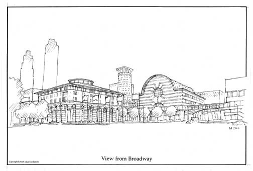
The cartoon version of Michelangelo’s Piazza di Campidoglio, with the inevitable fountain in place of Marcus Aurelius, has none of the subtlety of the hilltop original, with its trapezoidal space and elliptical paving. The entrance plaza sits up and apart from Broadway and creates a barren precinct that ignores the possibilities of one of the few avenue intersections of Broadway that elsewhere create such great spaces as Union Square or Madison Square. The block-wide avenue to Central Park that was proposed in the 1950s failed, and now the whole complex is a monument to the bankrupt dreams of ordered modernity that seemed to offer so much in the years after World War II. With a new start, something more than a cultural ghetto can be handed back to the city.
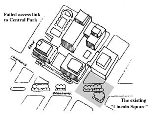
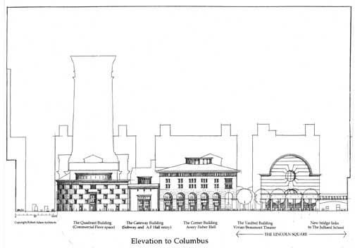
Why enter the complex from the center of the block? Other than the lonely triangle of Dante Park, there is no logic, except for a misunderstanding of axial planning. Lincoln Square, another lonely triangle, is at least closer to the 66th Street subway station. If we were to combine it with the bare space in front of the Juilliard School, and with a new plaza at grade on the southwest corner of Columbus Avenue and 65th Street, we would create a significant new urban space.
An expanded Lincoln Square could give a more public face to the Vivian Beaumont Theater and Avery Fisher Hall. The design of these buildings, individual and imposing, would add to the sum of the new space and give an identity barely offered by the blank face of the Juilliard School or assisted by the cold commercial buildings across Columbus Avenue.
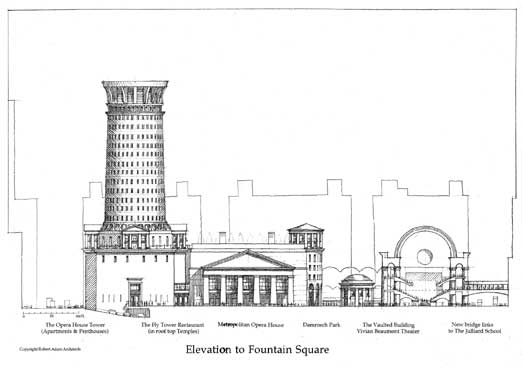
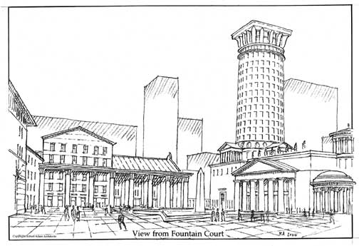
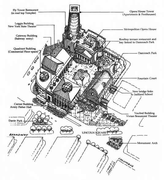
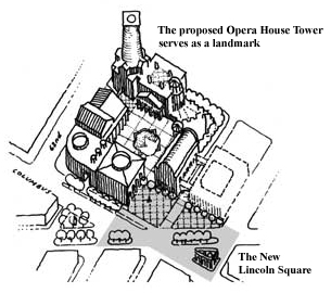 Diagonally across the new plaza, a distinctive new tower and a view of a massive Doric portico show the way to a large square at the heart of the block. In contrast to the public gesture of the plaza, this square is a pedestrian sanctuary from the clamorous roads outside. All the public buildings bound the new square. The Doric portico announces the entrance to the Metropolitan Opera House. A long Corinthian loggia flanks the south side of the court and leads to the New York State Theater. The Vivian Beaumont Theater and Avery Fisher Hall form the other sides of the square, and a rotunda gateway opens onto a relocated Damrosch Park.
Any suggestion of the monotonous repetition, grinding symmetry, and crude axiality of the original are scrupulously avoided in the buildings and spaces. Great spaces do not always have major entrances exactly in the center of each side. When buildings have different functions, they can have different characters. Classical architecture has an epic history; it has looked across the endless variety of the centuries, and there is no limit to invention. All the excitement, sophistication, and nobility of this tradition should be made available to New York in this, its cultural center.
And why should culture be purged of commerce? Culture belongs in the throng of the multitude and thrives on the wealth of the people. Space made only for refinement runs the risk of sterility and exclusion. The addition of apartments and commercial buildings to Lincoln Center will add not only vitality and daylong activity to the space but also will enhance the value of the real estate.
The apartment tower has as its plinth the blind fly tower of the Metropolitan Opera House. Elevators rise to a public rooftop garden and restaurant and to the entrance to the apartments. Further elevators link the roof to Damrosch Park by way of a circular tower. On Columbus and 62nd Street, a low office building acts as a corner link between Avery Fisher Hall and the New York State Theater.
What an opportunity would be lost if the crumbling Lincoln Center were just to be patched up for the same cost as starting again. Since it was built, we have re-learned forgotten lessons about civilized space and civil architecture. Now is the time to create great monuments to the civilization that is America.
Michael M. Franck, Arthur C. Lohsen, James C. McCrery II
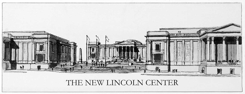
Lincoln Center was built at a time when architects believed that the present was so vastly different from the past that the past no longer had meaning. The atom had been split, polio cured: no problem seemed too great for the application of cold, scientific reasoning. Modern architecture was an expression of that attitude, and Lincoln Center was a collaborative effort of the most notable modernist architects of a generation.
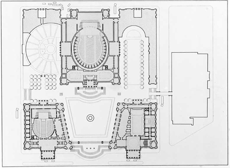 While it was noble that the designers loosely followed the urban form of Michelangelo’s Campidoglio in Rome, Michelangelo’s subtleties make Lincoln Center pale in comparison. Our proposal builds upon the legacy of Lincoln Center – or at least upon the Campidoglio model that inspired it.
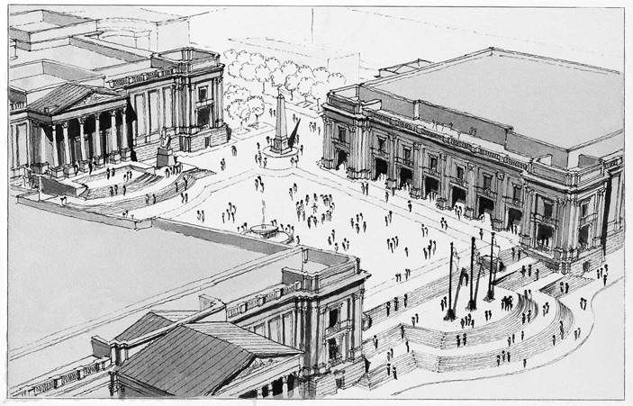
Our buildings come out to Columbus Avenue. Their facades hold to the street edges; their great porticos embrace the street and sidewalk approaches. The difference in elevation from the street level to the courtyard level enabled us to create a grand staircase that spills onto Columbus Avenue, connecting the entire complex to the city. The New York State Theater and Avery Fisher Hall, twins, define and contain the plaza. The plaza facade of the twins follows more closely the Campidoglio example through the simple gesture of angling the facades – a device that further defines and contains the plaza. The main halls of each of these buildings open onto the plaza, and two-story arcades along the north and south sides of the plaza shelter small cafés, which enhance the celebratory character of a quintessentially urban space.
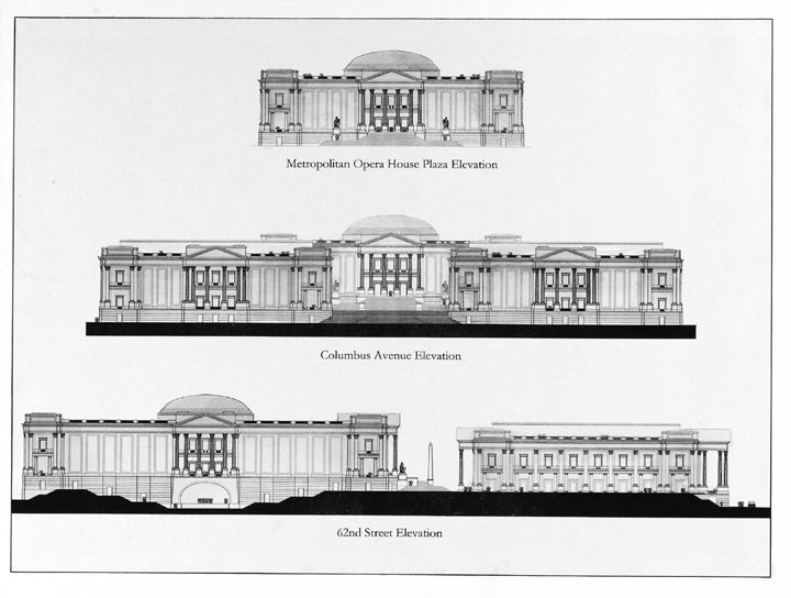
The Metropolitan Opera House, both central and removed, sits upon its pedestal above the plaza but is also a full participant in the formation of that space. The composition of the facade brings scale to the building and to the plaza. Large panels on the front facade, similar to those on the Columbus Avenue facades of the twins, will frame banners promoting current and forthcoming events, and a temple-like front portico serves as the ceremonial entry. The friezes and panels on all the buildings invite inscriptions commemorating great composers or conductors.
The plaza – its character and shape defined by the architecture of the three buildings that contain it – is unlike any other urban space in New York. Arcades and stairs ensure a pedestrian flow in and around it, making people central to its drama, and the obelisks, statues, fountains, pedestals, and flagpoles that enliven the space provide places for people to gather.
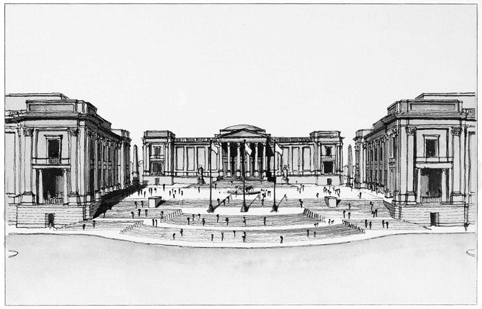
The complex along Amsterdam Avenue again holds to the avenue’s edge, participating in the endeavor of all great urban architecture: making good streets. The buildings house retail spaces along their Amsterdam Avenue side, with offices above. To the north of the Opera House, the new home to the Vivian Beaumont Theater and Library is arranged in a manner that encloses an exterior garden intended for outdoor musical performances. The south facade of the Opera House incorporates the proscenium and stage for a new outdoor amphitheater.
The new Lincoln Center would be much easier to visit. A three-lane drop-off at grade would be sheltered by the porticos at the New York State Theater and Avery Fisher Hall. Four entrances lead down into a parking structure beneath the entire site. Loading docks are likewise below ground, removing such eyesores from the pedestrian’s realm. A smaller, graceful bridge replaces the virtually unused brutal concrete structure that now connects the plaza to the Juilliard School, opening 65th Street to light and air.
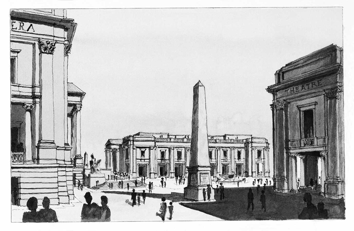
The architecture of the new Lincoln Center is classical – an architectural language shared by all of Western society, developing over thousands of years and capable of dynamic development in the present and future. It is founded on the human form and has human scale, even in the largest of buildings. It is an architecture of curves, of shifting shadows, of subtlety. It seeks, unashamedly, to be harmonious and beautiful.
Classical architecture is physically and stylistically durable. Most buildings today are built to last 25 years before major renovation or replacement. Classical architecture employs solid materials and construction methods that have been developed and improved over millennia to shed water and hold buildings together. That means that our children will not have to rebuild what we leave them. Fifty years from now, our grandchildren will be evaluating our decisions, as we are now evaluating the original Lincoln Center. Should we not leave behind us an embodiment of the timeless values of humanity?
